How Do You Like the Department of Tourism's New Campaign Logo?
You can download the logo's font for free.
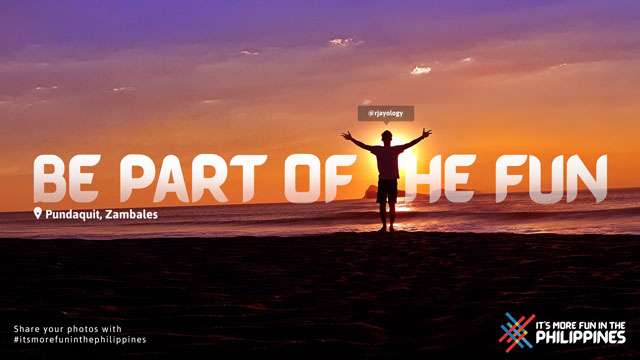
(SPOT.ph) When she assumed office in 2018, Department of Tourism (DOT) under Sec. Bernadette Romulo-Puyat started laying the groundwork on a new advertising campaign for the tourism agency. Finally, on February 18, the agency unveiled its slogan: The beloved and all-too-familiar "It's More Fun in the Philippines", which came with a brand new look. Check it out:
As you can see, the new logo has more curves around the edges and features an all-caps set. It also dropped the Philippine map and stuck with a design that, according to Puyat, "weaves the unique colors of our flag together."
In line with the launch of the campaign (which, by the way, was 100% crowdsourced), the agency also kickstarted an online campaign that encourages people to post their local travel photos on social media using the hashtag #ItsMoreFunInThePhilippines.
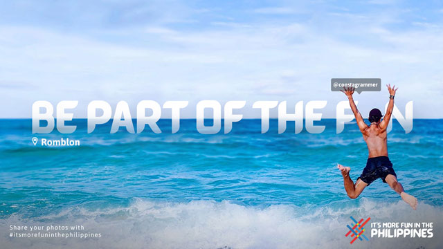
And since the catchphrase has long been lauded for its flexibility, DOT also released a downloadable font called Barabara, which people can use for their snapshots. The free font was inspired by the typeface of hand-painted signboards you typically see on public jeepneys and buses.
"I actually believe in continuity. In other countries, they never change their campaign,” Puyat pointed out during the press launch earlier this week. "I am the third Tourism secretary to use the hashtag. I believe it’s because it works. The Philippines has embraced the hashtag. We’ve made it our own. Why not continue what’s good?"
So what do you think of DOT’s new logo for the campaign? Let us know in the comments section.