

Another Logo? A Look Into Bongbong Marcos’ Bagong Pilipinas Branding
No public funds were used in the creation of this logo, PCO said.
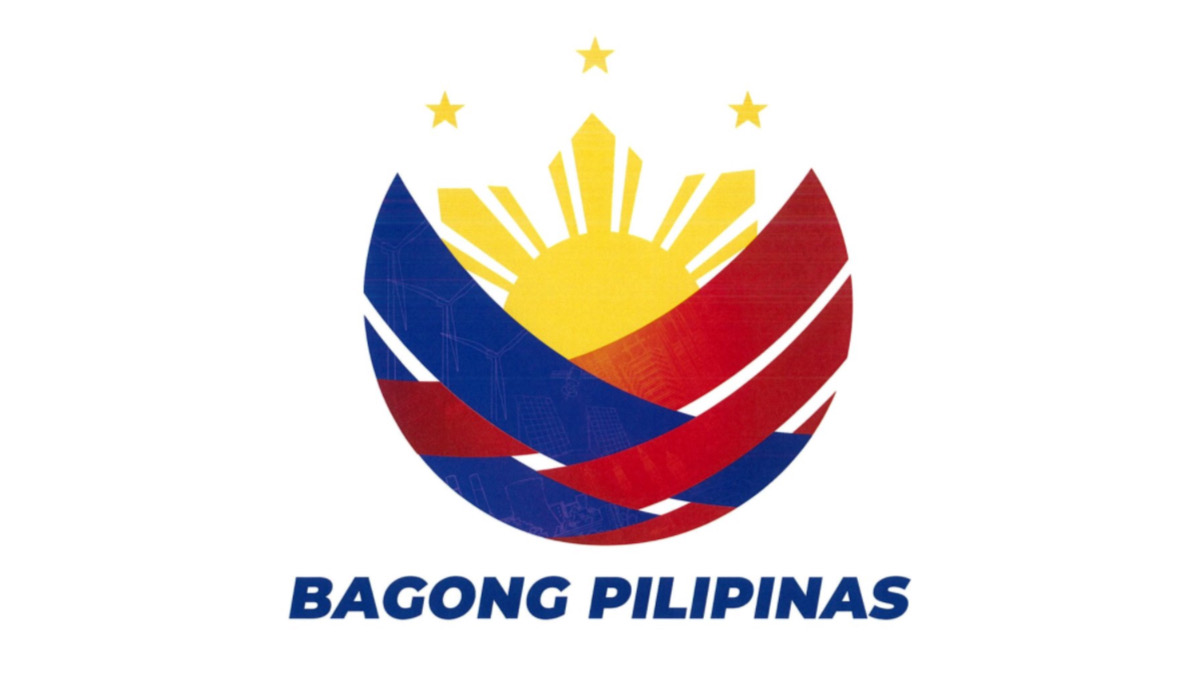
(SPOT.ph) Less than a week following PAGCOR's logo controversy, President Ferdinand "Bongbong" Marcos Jr. has adopted his election campaign slogan “Bagong Pilipinas” for his administration’s official branding—with its own logo.
Bagong Pilipinas was introduced as the "overarching theme of the Administration's brand of governance and leadership, which calls for deep and fundamental transformations in all sectors of society and government" under Memorandum Circular No. 24.
The new logo was "produced internally" by the government's lead communications arm without the use of public funds, according to the Presidential Communications Office (PCO).
"This was accomplished without any cost to the government," PCO said in a statement.
Also read: Before the PAGCOR Logo Fiasco, There Was SEA Games and Bangko Sentral
What the Bagong Pilipinas logo means
It's common for presidential administrations to come up with government slogans, but not so common for them to launch it with a logo. There's Rodrigo Duterte's "Change is Coming," Benigno Aquino III's "Daang Matuwid," and Joseph Estrada's "Erap Para sa Mahirap," to name a few.
PCO explained that the Bagong Pilipinas logo shows various stages of development in the Philippines’ journey toward the future.
The three red stripes refer to the Philippines' post-war agricultural and rural development, the post-colonial period, and the current metropolitan development. The blue stripes show a "progressive Philippines that leverages technological advancement in pursuing sustainable industrial development."
The rising sun signifies the dawn of a new Philippines, while the weave pattern illustrates the interconnectedness and unity of the Filipino people.
“Overall, the Bagong Pilipinas logo embodies the Marcos Administration’s vision for the country, emphasizing unity, involvement, and the bayanihan culture as the main fibers and components for its full realization," PCO said.
Also read: Did You Know That the New PAGCOR Logo is Worth P3 Million?
"Obsession for rebranding projects"
A clearer version of the Bagong Pilipinas was released a few hours after the attached logo in the Memorandum Circular No. 24 was signed for publication. Faint graphics of windmills and solar panels are seen on the red and blue strips of the logo, which could be in reference to PBBM's push for renewable energy sources in the Philippines or the Bangui Windmills in his hometown in Ilocos Norte.
While some lauded the new logo, but others also pointed out how it's reminiscent of late President Ferdinand Marcos Sr.'s branding of "Bagong Lipunan" throughout his dictatorship in the 1970s.

Gabriela Women's Partylist said that the Bagong Pilipinas rebranding was "replete with ironies amid same meager wages, reign of dynastic politics." Instead, they urged the government to place its focus on more pressing issues beyond rebranding projects.
"What's next? A logo for Maharlika Investment Corporation? The administration must cut its obsession for rebranding projects and buckle down to work to address mounting calls for decent jobs, higher wages and lower prices," Gabriela representative Arlene Rosas said.
Senator Risa Hontiveros also made a hit at PBBM's campaign branding: "Talagang nauna pa lumabas 'yung logo ng Bagong Pilipinas kaysa sa totoong pagbabago."
Also read: It's Legit: There's a PAGCOR Logo-Making Contest for Freelancers Worldwide