
Did You Know That the New PAGCOR Logo is Worth P3 Million?
Courtesy of a design agency with little to no online presence.

(SPOT.ph) The Philippine Amusement and Gaming Corporation (PAGCOR) celebrated its 40th anniversary on Tuesday, July 11, with the unveiling of a new logo that has been receiving criticism on several online platforms.
It's not just about the logo with an uneven gradient fade; it's that the Philippine government paid a whopping P3,035,714 for the new logo that replaced the green-and-yellow signature logo we've known for decades.
What does the new PAGCOR logo mean?
From green and yellow to red and blue, the switch was meant to highlight the agency’s “re-energized role” as the main gaming regulator in the country.
"The new PAGCOR logo incorporates the element of fire associated with energy, inspiration, passion, and transformation. It symbolizes the flame that ignites change and drives progress. The logo likewise reflects a beacon which symbolizes guidance, leadership, and direction. It represents a guiding light that helps people find their way,” PAGCOR Chairman Alejandro Tengco said in a press release.
“All these taken together, our new logo reflects PAGCOR’s long standing commitment of being a guiding force that illuminates the way forward, drives transformation and development, and brings inspiration and motivation to the lives it touches."
Also read:
No 'More Fun in the Philippines' As DOT Unveils New Tourism Slogan
"Love the Philippines" and The Stock Videos Issue: Here's What Happened
The controversy surrounding the new PAGCOR logo
PAGCOR awarded this contract to a single proprietor: Francisco D. Doplon of PrintPlus Graphic Services from Las Piñas City on June 27 as per the Notice of Award found on its official website.
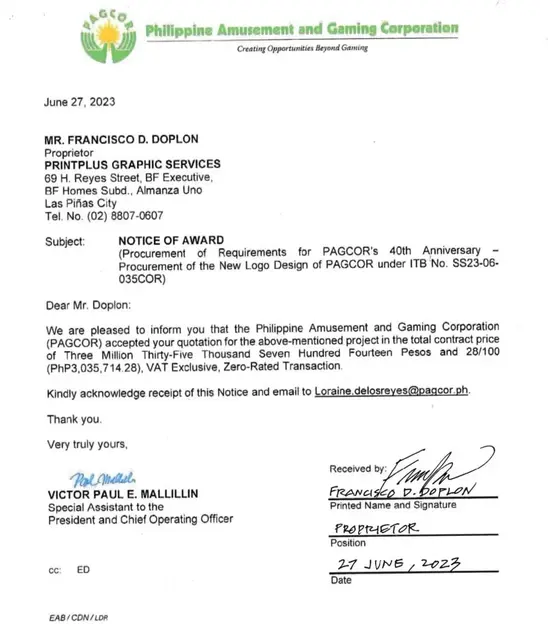
Several online users have noted that PrintPlus Graphic Services seems to have little to no presence on the internet. A quick search showed one Facebook page created in 2014 with the name "PrintPlus" based in Las Piñas City with only 62 likes, but it is unconfirmed if this is the design agency that is linked to PAGCOR's contract.
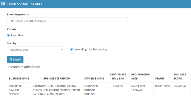
What is confirmed is that PrintPlus is a duly registered business with the Department of Trade and Industry (DTI) since March 2021, based on its Business Name Registration System database.
Also read:
Everything You Need to Know About the 2019 SEA Games
Reactions, Reimaginings, and a Retraction of the 2019 SEA Games Logo
Here’s what Twitter users have to say about PAGCOR’s new logo, likening its color and design similiarities to brands like Petron Corporation and Lucky Me!:

Others came up with suggestions on a better logo:
Even Angkas chimed in on the fun with a logo change of its own:
Also read: Why New Leni-Kiko Logo Has Colors of the Flag, Foes