

Before the PAGCOR Logo Fiasco, There Was SEA Games and Bangko Sentral
"If it ain't broke, don't fix it."

(SPOT.ph) If there's one thing that will squeeze creative juices out of Filipinos, that would be a bad graphic design paid for by the taxpayers. With the release of the new red-and-blue PAGCOR logo, irked Filipinos took to social media to complain about a possible waste of public funds. Some even went so far as to create their own versions to compete with the official one.
This happened twice in a span of three weeks, resulting in social media users refreshing their memories on other viral logos created by the government that Filipinos and the rest of the world have witnessed in recent memory.
"If it ain't broke, don't fix it," social media users said.
Also read: Did You Know That the New PAGCOR Logo is Worth P3 Million?
PAGCOR logo, other controversial government logos in recent memory
Let's take a look at a few controversial logo changes that had the online world scratching their heads in confusion and regret.
PAGCOR's Petron x Lucky Me logo
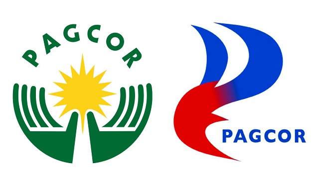
The latest to capture the ire of Filipinos is the P3-million PAGCOR logo, with its uneven gradient fade and uneven curves that resembles that of the petroleum company Petron and the instant noodles company Lucky Me.
The new logo was unveiled just in time for its 40th anniversary to highlight its "reenergized role" as the country's gaming operator.
"The new PAGCOR logo incorporates the element of fire associated with energy, inspiration, passion, and transformation. It symbolizes the flame that ignites change and drives progress. The logo likewise reflects a beacon which symbolizes guidance, leadership, and direction. It represents a guiding light that helps people find their way,” PAGCOR Chairman Alejandro Tengco said.
“All these taken together, our new logo reflects PAGCOR’s long standing commitment of being a guiding force that illuminates the way forward, drives transformation and development, and brings inspiration and motivation to the lives it touches."
Aside from the controversial logo, others also questioned the bidding process. Senator Grace Poe said P3 million is a "staggering amount" to spend on a logo "considering how much work was put into it."
Department of Tourism's "Love the Philippines"
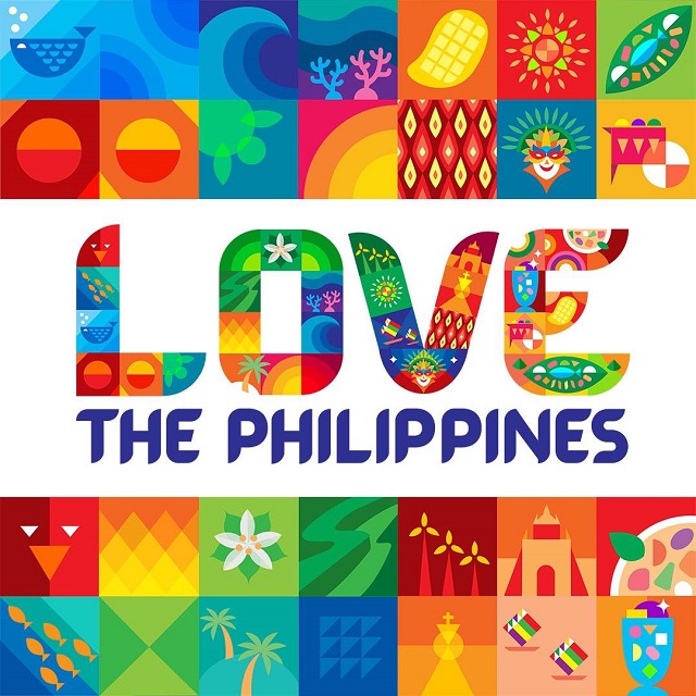
The PAGCOR logo isn't the only controversial one this year. Less than a month before the PAGCOR logo launch, the Department of Tourism also went viral for scrapping the multi-awarded "More Fun in the Philippines" for the 2023 version "Love the Philippines."
The new campaign, worth P49 million, was trending not only because of the logo which had to change because of the slogan, but because of the "Love the Philippines" tagline which some social media users felt gave "needy" and "palautos" vibes, all of which some pointed out could be fixed with the addition of a comma.
It was also hit by another controversy: the alleged use of foreign stock videos in a mood video supposedly reserved for the eyes of internal stakeholder but was publicly shown during the 50th anniversary celebration of the department and was also posted online. This eventually led to DOT ending its multi-million contract with the ad agency DDB Philippines.
Also read:
No 'More Fun in the Philippines' As DOT Unveils New Tourism Slogan
"Love the Philippines" and The Stock Videos Issue: Here's What Happened
DOT Is Terminating Contract With Ad Agency Behind "Love the Philippines"
Bangko Sentral's eagle logo
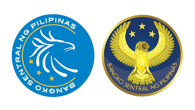
In the middle of the COVID pandemic in 2020, Bangko Sentral ng Pilipinas said goodbye to its sleek logo of an eagle's profile on a light blue background for a gold, full-bodied eagle in flight on a darker blue background.
Then BSP Governor Benjamin Diokno said it was to reflect its "renewed vitality" and to "underscore its integrity and competence."
While the new logo reflected the same elements in the old one, its new design doesn't look modern and looked like a "step backwards" compared to the 10-year-old logo. Plus, there's nothing wrong with the old one so "why change?" according to some Twitter users.
Some P52.5 million was reportedly allocated for the logo change, which included the production and replication of ad materials across different platforms and for "public relations and advertising", website Bilyonaryo said. The central bank refuted the rumors, saying the logo was developed "in-house" thus there was no procurement needed.
The 2019 SEA Games logo

Who can forget the 2019 Southeast Asian Games (SEA Games) "We Win as One" logo? The Philippines was the host of the 30th biennial sporting event, meaning the country was in charge of the logo.
The result? Eleven interlinked rings—a representation of the 11 Southeast Asian nations—arranged in the shape of the Philippines to embody “ideas of unity and togetherness.”
“Our logo will be the 11 circles representing the 11 countries bound together in the shape of the Philippines to symbolize that wherever and whenever the games are played, we are one and we win as one," said Alan Peter Cayetano, Philippine SEA Games Organizing Committee Chair.
The logo was met with criticism online, with social media users creating their own versions just to show that if there were a multiverse, the Philippines would have a different and "better" version suited for global release. Even budget store Japan Home Centre, famous for products worth P88, and Nissin Ramen Philippines hopped in on the fun with their own logo iterations.
Even Pami, the mascot whose name was derived from "Pamilya" or family, wasn't spared from criticisms. In case you forgot, Pami is this small, ball-type figure social media users have compared to boba pearls, and the humble merienda bilo-bilo.
"Pami represents every nation, every athlete, every person coming together that support each other at the games. Of course it came from the word 'pamilya,' meaning, family. It's created from spheres, squishy balls, that is joyful," said 2019 SEA Games executive director Ramon Suzara.
Also read:
Reactions, Reimaginings, and a Retraction of the 2019 SEA Games Logo
Everything You Need to Know About the 2019 SEA Games